
About the Design: Safety Is A Mindset
In April of 2025, Brandon Beaver, CEO & Co-Founder of Safety is a Mindset, reached out to me via Contact Form on my website. He was looking for me to develop branding for him and his new business, Safety is a Mindset. I was so ecstatic, not only was this going to be my first real client, but this was a business that was going to be based out of Texas. So it’s a crazy statement that I get to say my first client was already out of the state!
A little information about Safety Is a Mindset
Their website states, “At Safety Is A Mindset, we deliver far more than just certifications and compliance paperwork—we deliver the mindset, muscle memory, and mission-critical skills your team needs to respond effectively when lives hang in the balance. Our goal is to fundamentally transform the way organizations think about emergency preparedness by making safety not just a regulatory requirement, but a deeply embedded part of workplace culture and everyday decision-making.” (https://safetyisamindset.com/about/) They offer services like: Active Violence Immediate Response Training, AHA-standard CPR/AED training, and OSHA-compliant safety programs.
But let’s get into the fun part… the design!
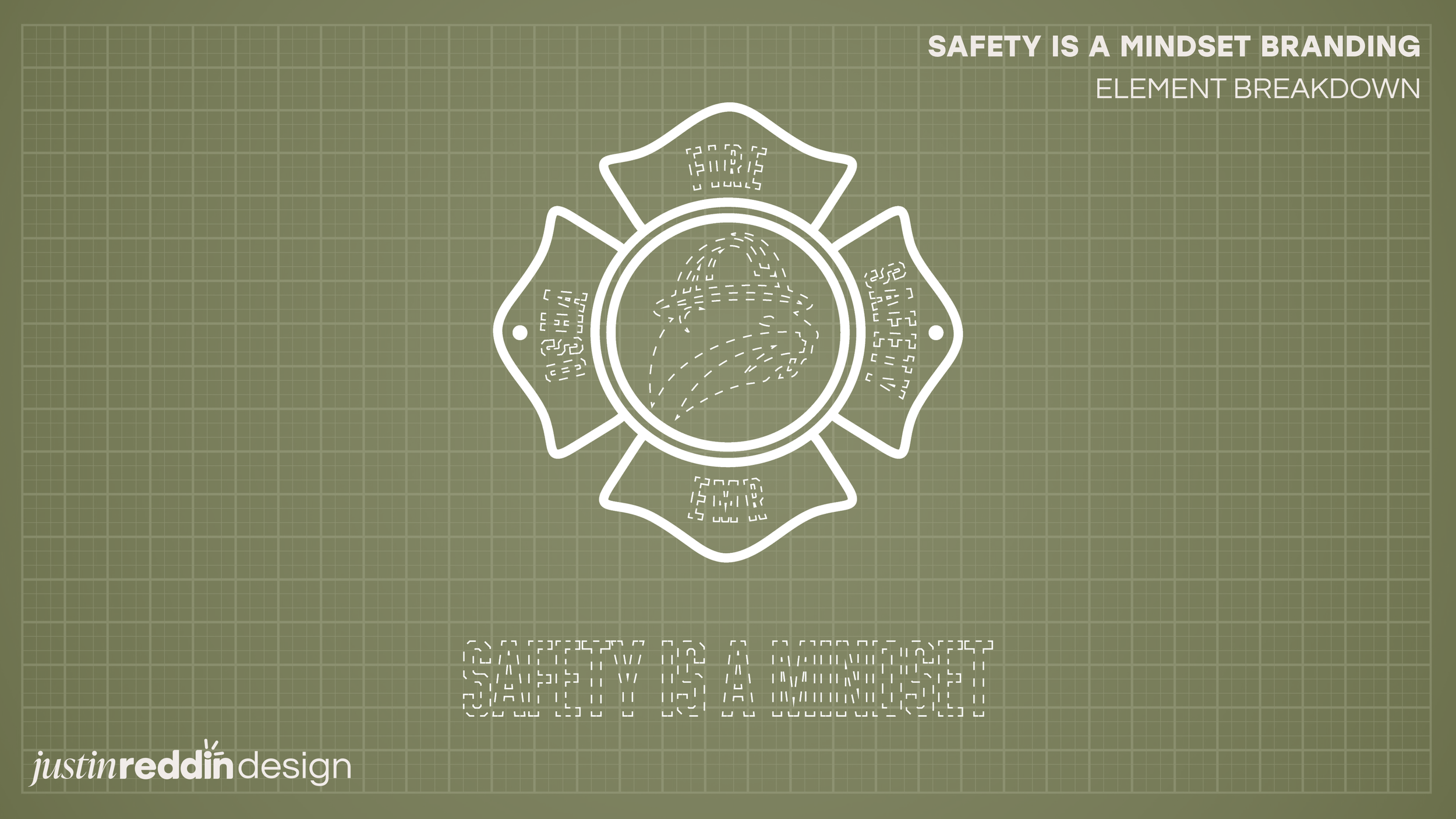
To start off the logo design, we start off with the badge, resembling the iconic badge shape found in fire station logos. The badge embodies a sense of strength, safety, and commitment to community service. I wanted to go for something that already has history and meaning, choosing something that people look at and already know that this business is a business they can trust.
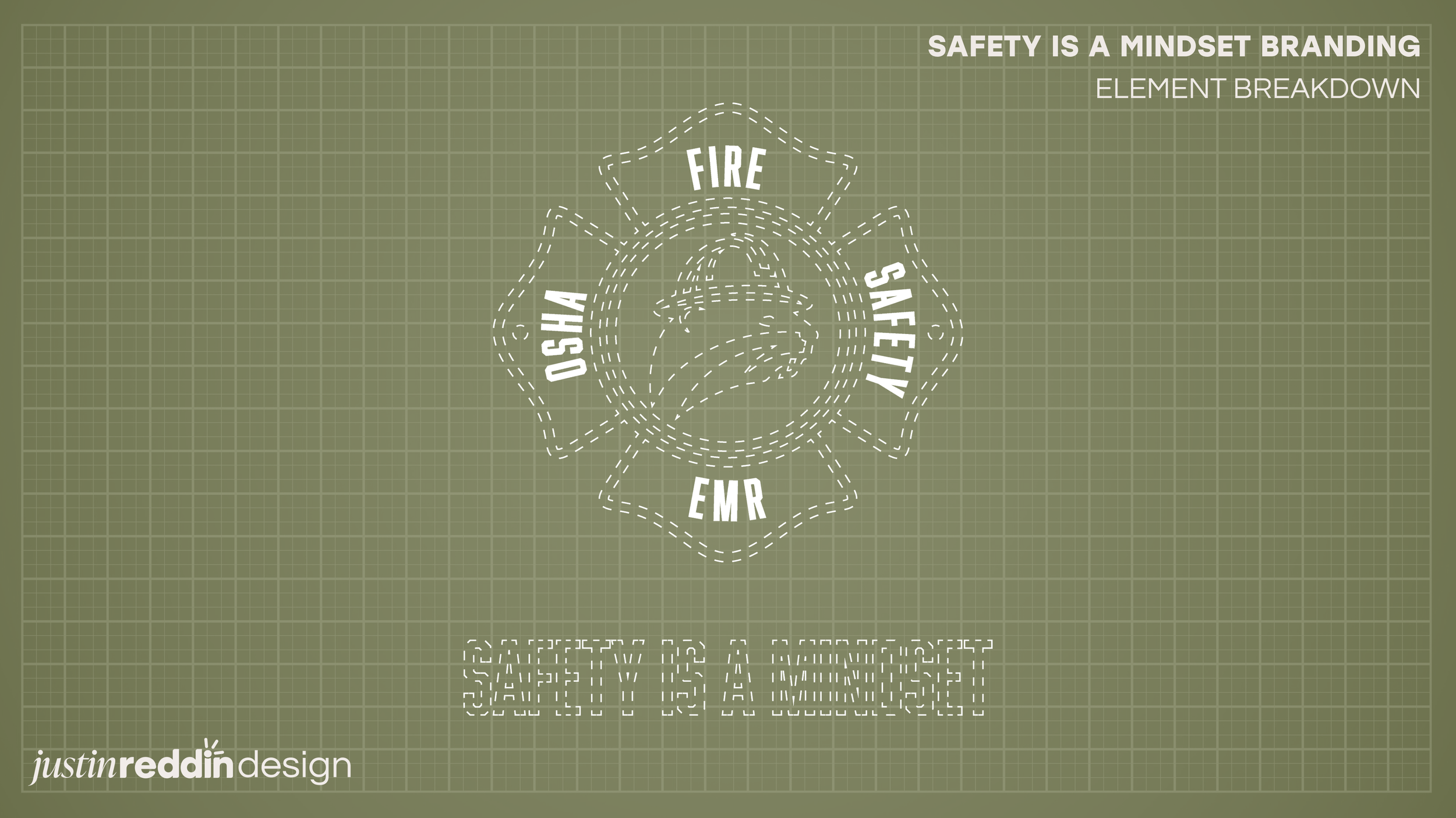
The badge text highlights the services they prioritize in their company. The Left badge, OSHA, is because of the “OSHA 10/30 General Industry & Construction Safety Training” they provide to customers. The top badge, FIRE, is because of the “Emergency Action Plan Development and Drill Facilitation” they provide when working with clients to prioritize the safety of the staff when a fire or other disaster occurs. The right badge, SAFETY, is because of the main goal of their business, providing solutions to keep a safe work environment, and ensuring staff know what to do when in immediate danger. The bottom badge, EMR, is because of their service that provides Emergency Response Operations, ensuring staff know what to do in certain instances of danger!
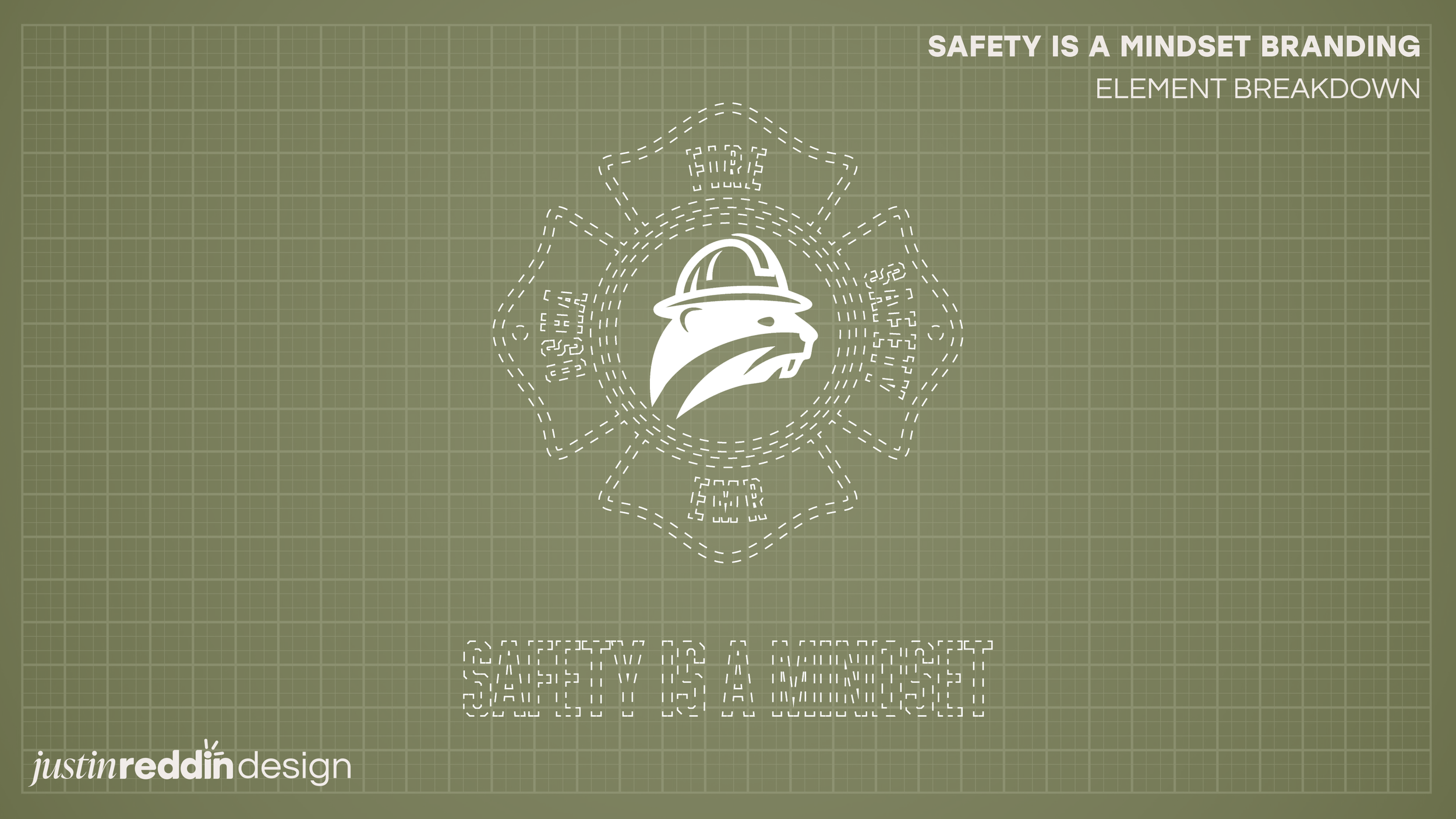
Now, to one of my favorite and iconic elements of the logo, the beaver with a hard hat. The beaver symbolizes the company's founders, Brandon Beaver (Founder & Co-Owner) and Travis Beaver (Navy Corpsman & Firefighter). Ensuring that the two key men in the operation were recognized was a key element for me. And the addition of the hard hat just adds more emphasis on the importance of safety within the company.
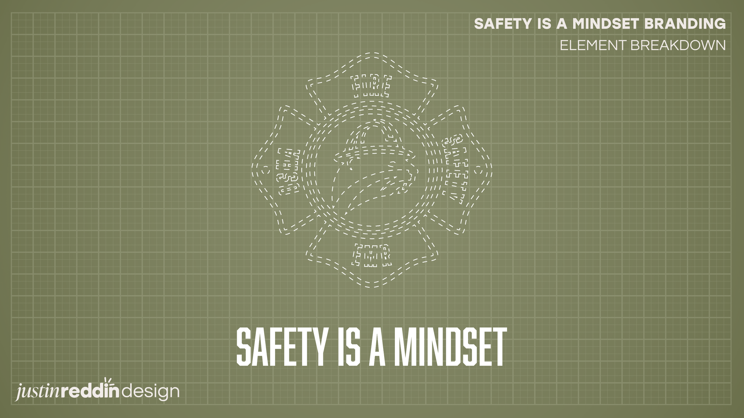
With the name badge I didn’t want anything crazy. I felt that it would take away from the main design of the logo. I felt that it just needed a clean font text at the bottom or even the size to wrap everything up, and I feel like it did it’s purpose.
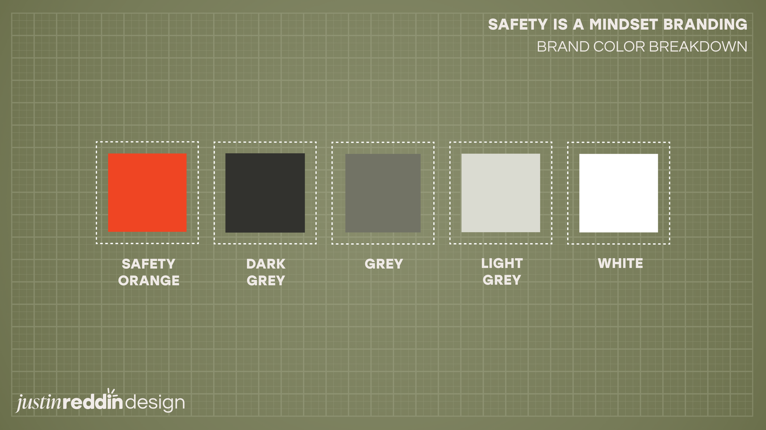
The branding utilizes the industry standard colors for safety companies and their branding. You have the iconic Safety Orange, tones of Grey, and White. Now you may be wondering, “Why didn’t you just use black instead of dark grey?” Well, it is simple, I hate using black in branding like this. The only reason why black should be used is if it is the main focal point. Putting an already “harsh” orange up against a solid, bold black would look very bipolar, haha. But using that subtle charcoal grey just helps the orange pop, but still gives you that dark, rich color for an accent.
I feel like the branding was pretty successful, and the client really liked it and has used it on everything they do now!
If you would like to look into this company or utilize their services for your own business, here is their information!
Safety Is A Mindset
Instagram: @safetyisamindset
Facebook: @safetyisamindset